Role
UX/UI Designer (self-directed)
Scope
User research, prototyping, design systems, stakeholder alignment, visual system design
Tools
Figma, Figma Make, Amazon’s internal component design system
Context
Formal UX coursework applied to real product challenges at Amazon
I enrolled in a UX/UI design program to deepen my user experience skills and immediately applied what I was learning to real product challenges at Amazon. This section shows both: the research methodology I built through coursework (using a meal planning project as the vehicle), and how I applied that same methodology to solve actual problems at work.
Part 1
A research-driven exploration of meal planning challenges for working parents. The goal: understand why meal planning feels so hard for this audience and identify design opportunities.
5 in-depth interviews with working parents who manage meal planning for their households, supplemented by secondary research on time use, decision fatigue, and competitive analysis of existing meal planning tools.
Primary Research Highlights

From the interview data, I identified 6 recurring themes through affinity mapping, then built empathy maps that revealed two distinct user archetypes with fundamentally different needs. I created personas for each, defined their jobs-to-be-done, wrote How Might We questions to frame the design challenge, and prioritized user stories using MoSCoW to define what an MVP would need to include.
What came out of all of this: the problem isn’t cooking ability. It’s the mental burden of constant decision-making combined with limited time. Parents want structure, but rigid systems fail them.
Personas

I translated the requirements into a sitemap (app structure) and key user flows with decision-point branching.
User flow

The research produced 3 solution concepts, each addressing a different dimension of the problem: a flexible planning engine, a household preference filter, and a frictionless grocery/cooking companion.
Part 2
An internal leadership feedback platform at Amazon had gone through two previous rounds of UX work (an external vendor, then an internal designer redesigning the screens), but was still experiencing high abandonment rates on long assessments. I was brought in to optimize two specific components: the feedback submission form and the feedback report.
The challenge: program managers and engineering had conflicting priorities about the direction of the redesign. The form needed to support assessments ranging from 5 to 30 capabilities without overwhelming users or sacrificing data quality.
Approximately 30% of my bandwidth (alongside my full-time media design role)
Conflicting needs between program managers and engineering
Needed to work within Amazon’s existing component design system (internal component design system)
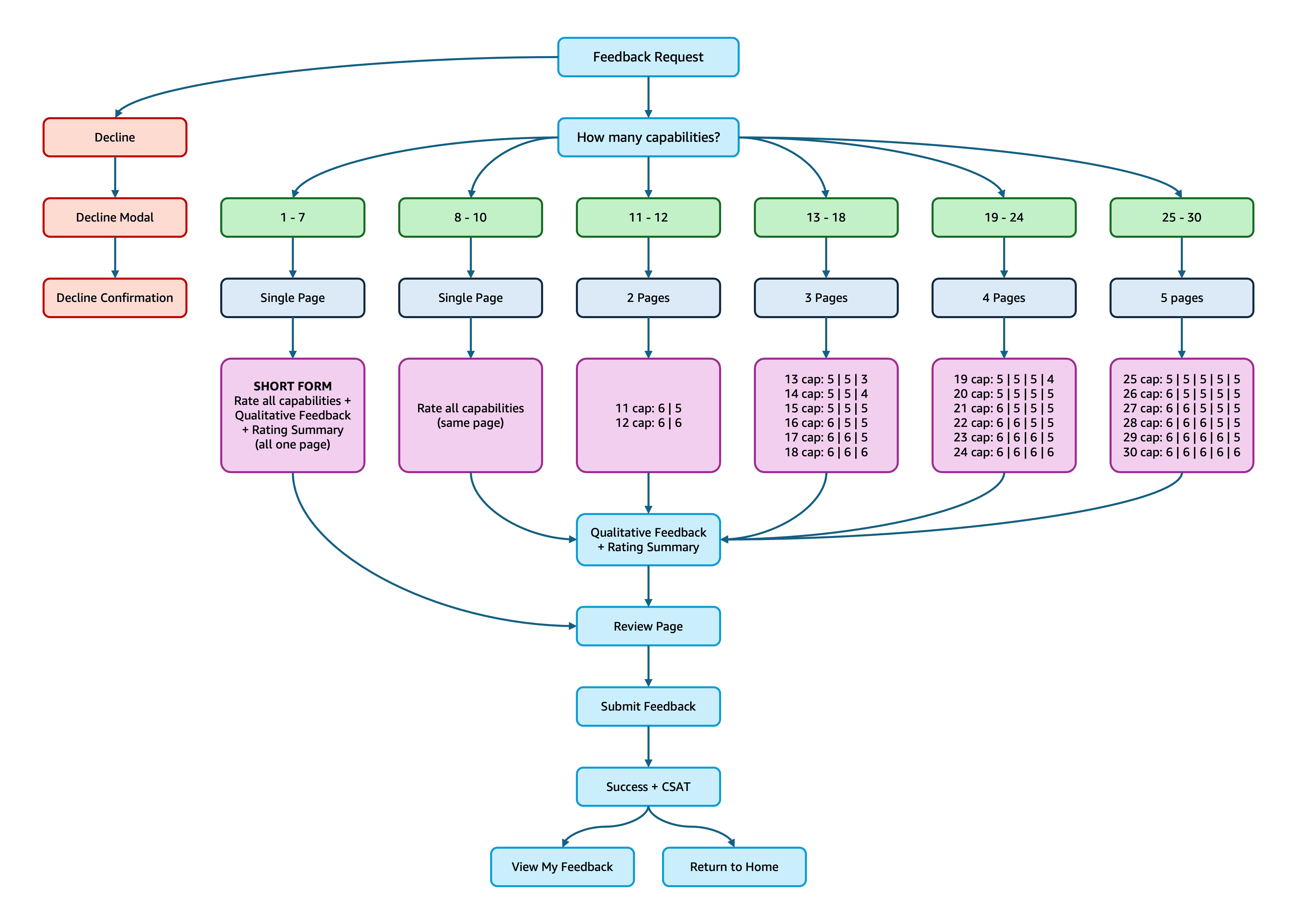
I developed an AI-augmented workflow in Figma Make that enabled 500+ rounds of prompt-driven design exploration. By using conversation as an iterative design tool, I could rapidly test layouts, interactions, and component approaches within my limited bandwidth. I mapped the full interaction logic as a user flow with decision-point branching to define how the 30-capability assessment would work before building it out.
I ran a focus group with 4 program managers, presented iterations across 4+ stakeholder sessions, and independently learned Amazon’s internal component design system to begin converting prototypes into production-ready designs.
Radio buttons for rating input
Faster completion, more accessible
Multi-page with progress indicators (30-capability assessments)
Reduces abandonment by showing progress; validated in focus group
Removed interactive behavior checkboxes for V1
Reduced user confusion and fatigue at scale
Drawer pattern for rating summary
Preserves screen space vs. persistent column
Opt-in AI feedback assistance with 30-character minimum
Prevents homogenized responses
3 stacked containers with jump links (feedback report)
Replaced confusing two-column layout
After validating the designs through focus group and stakeholder presentations, the project was transitioned to a UX/UI designer on another team within Amazon for production conversion. This type of UX work fell outside my team’s scope, so the handoff was the planned endpoint for my involvement. My role was research, prototyping, and validation; the remaining scope (converting all Figma Make prototypes into Amazon’s internal component design system across 15+ screen states) is being continued by the receiving designer.
Before handing off, I completed:
3 interactive prototypes (Figma Make): 30-capability form (10 screens with progress tracking), 5-capability short form, and feedback report
1 production-ready screen built in Amazon’s internal component design system, establishing the conversion pattern for the remaining screens
User flow diagrams with branching logic
Comprehensive handoff documentation (context docs, design decisions, meeting notes, specs)
Validated redesign approach through focus group with strongly positive reception
Generated cross-team demand: program managers from other teams requested UX support after seeing the prototypes
Delivered handoff documentation thorough enough that the receiving designer was asking targeted implementation questions within hours
Established the conversion pattern for translating AI-generated prototypes into production-ready design system screens
Developed and tested an AI-augmented design workflow that demonstrated how rapid iteration is possible at limited bandwidth
I also designed the visual system for an internal learning library where HR professionals discover curated development content. I created the logo, content-type thumbnails, a color-coded level indicator system, page layouts, and component designs for content cards and search UI. These mockups were used for stakeholder alignment and then handed off to a developer for implementation.


What I liked most about these projects: figuring out how to make something feel effortless for the user, thinking ahead for friction points before they become problems, and using AI to fundamentally change how fast and how far one designer can take a project.
Research · Information architecture · Interaction design · Rapid prototyping · Stakeholder alignment · Design systems · AI-assisted workflows · Visual system design · Content organization